back
back

Norlys
Role: LEAD PRODUCT DESIGNER
UI/UX DESIGN, INTERACTION DESIGN, MOBILE APP
From utility to usability
Problem
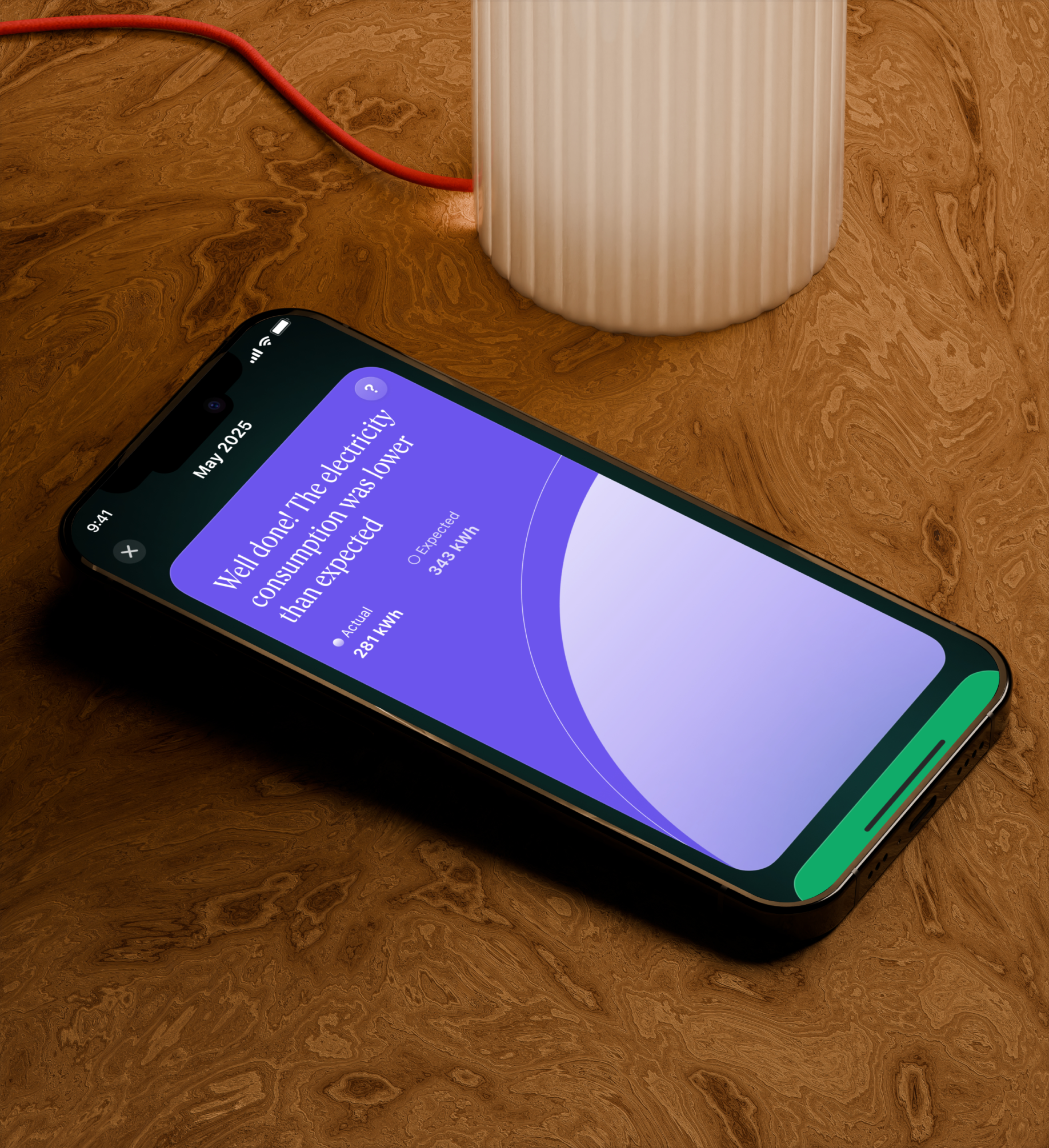
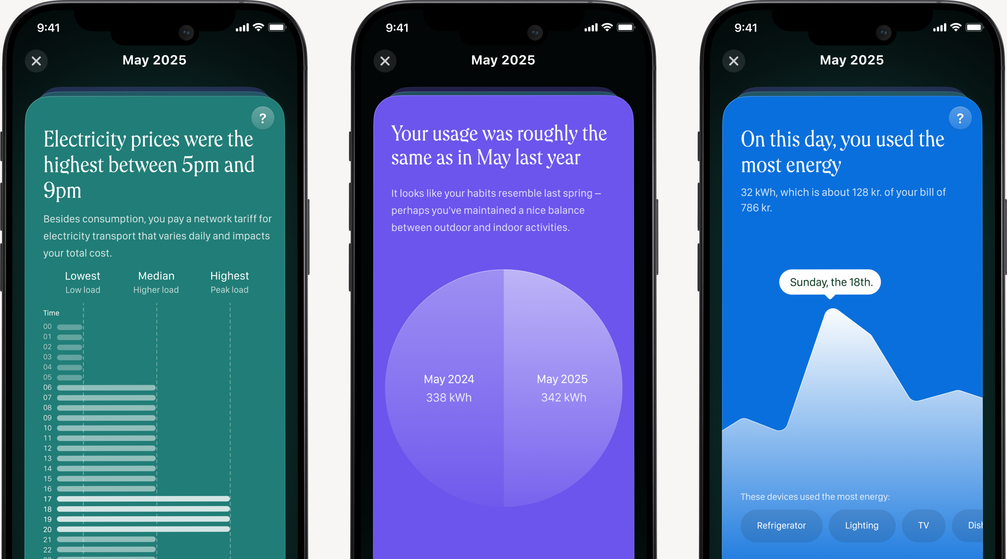
Norlys helps customers track their electricity usage, costs, and billing in one place. But helping people understand their energy use wasn't about providing more data - it was about making the data meaningful. We created Monthly Reports, turning months of abstract consumption into something tangible, personal, and even delightful. Customers received bills full of numbers but little context: how this month compared, what drove usage, or where energy went. The data existed, but the presentation didn't support real understanding.
Approach
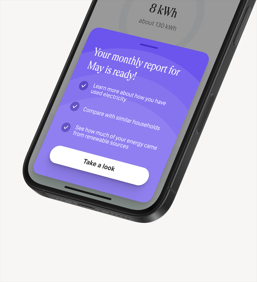
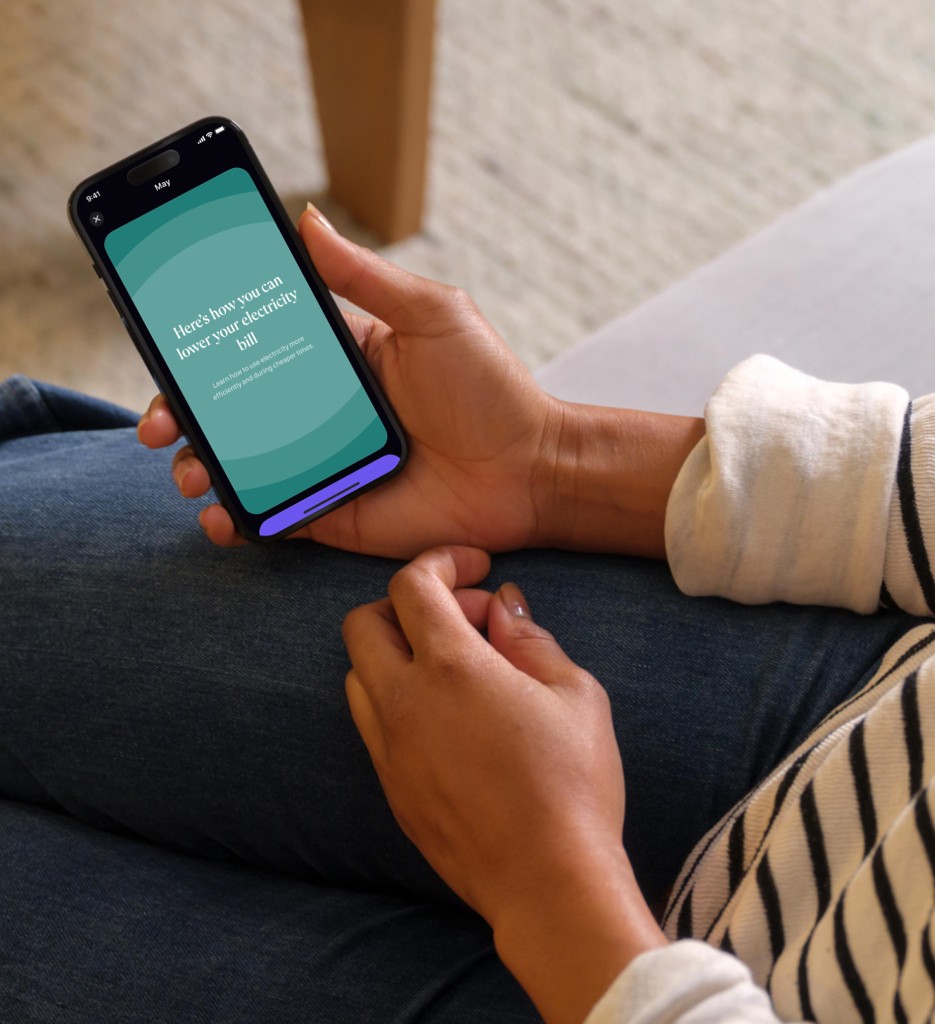
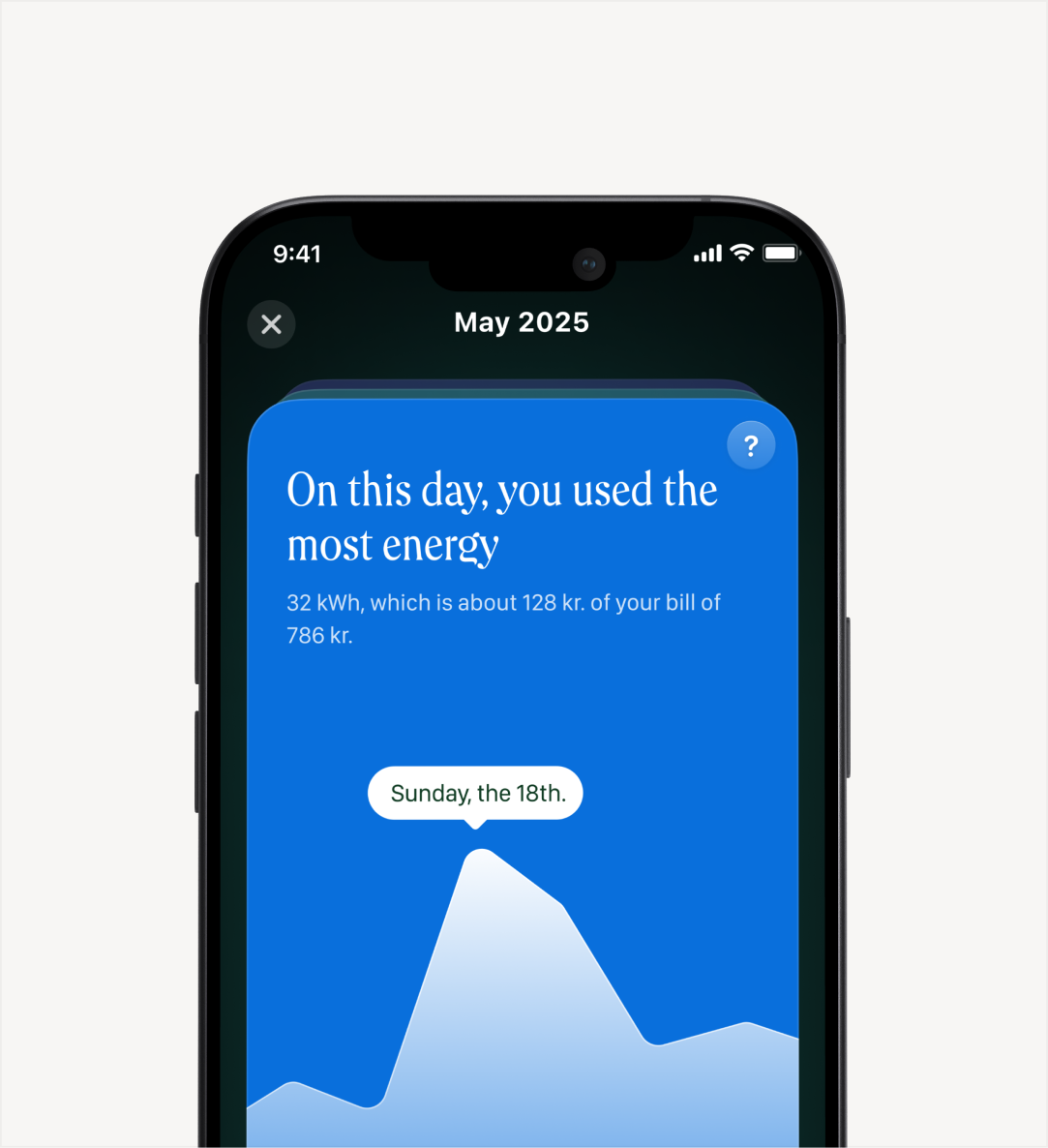
We found that customers are most attentive when their bill arrives, and often most frustrated. The Monthly Report was designed to meet them there, delivered in-app a couple of days after billing. Monthly Reports became an in-app feature that gives users a clear snapshot of their energy use, with simple comparisons, guided visuals, and subtle nudges to help them understand their consumption.
RESULT
The Monthly Report brought users back into the app regularly. App engagement rose by 30% as users returned to check their report, to better understand their energy use. What surprised us, was once users understood their patterns, they started asking better questions. Engagement with energy-saving tools and features increased by 38%.
Recognition
Danish Digital Awards 2025
Best in Digital Design (UI/UX) • Norlys Energy App
Silver