back
back
Barry energy
Role: LEAD UI/UX DESIGNER
UI/UX DESIGN, VISUAL IDENTITY, ILLUSTRATION
Smarter EV charging
Problem
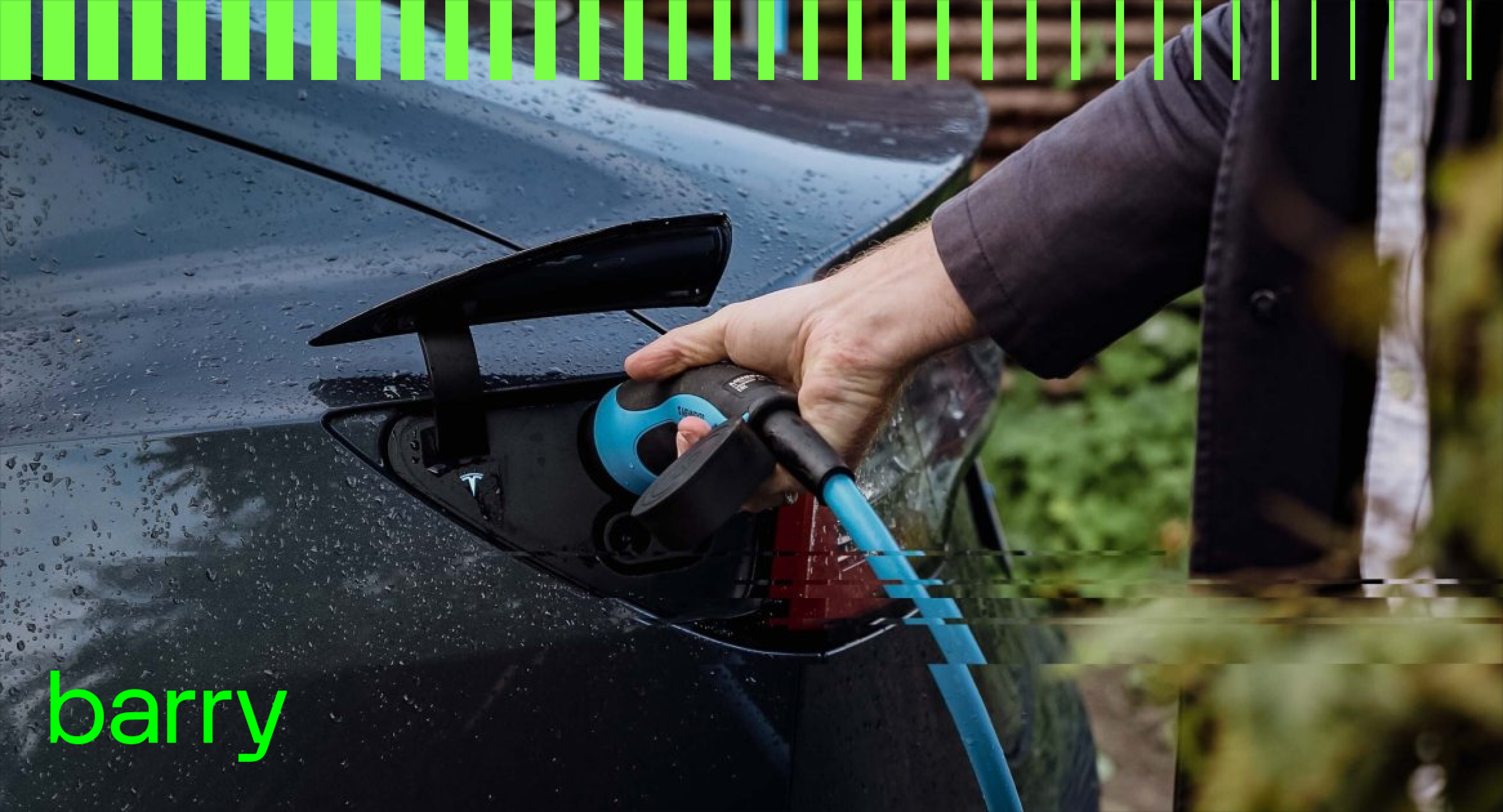
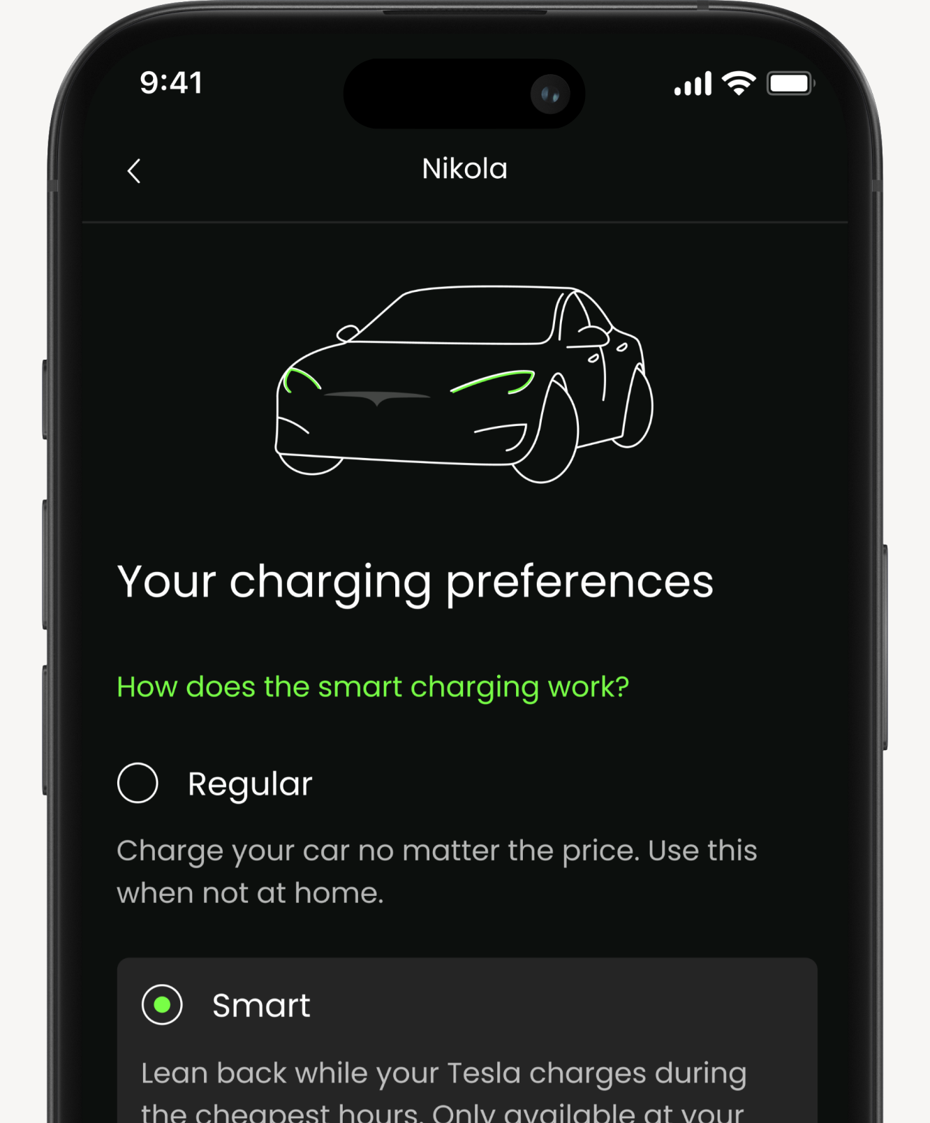
Barry Energy already had a clear brand: bold, green, and futuristic. As an EV charging app that helps drivers charge when electricity is cheapest, the product needed to feel just as smart and effortless as the service itself. The challenge was bringing that feeling into the experience, not just keeping things visually consistent, but making colours, icons, and interactions feel like part of the same whole.
Approach
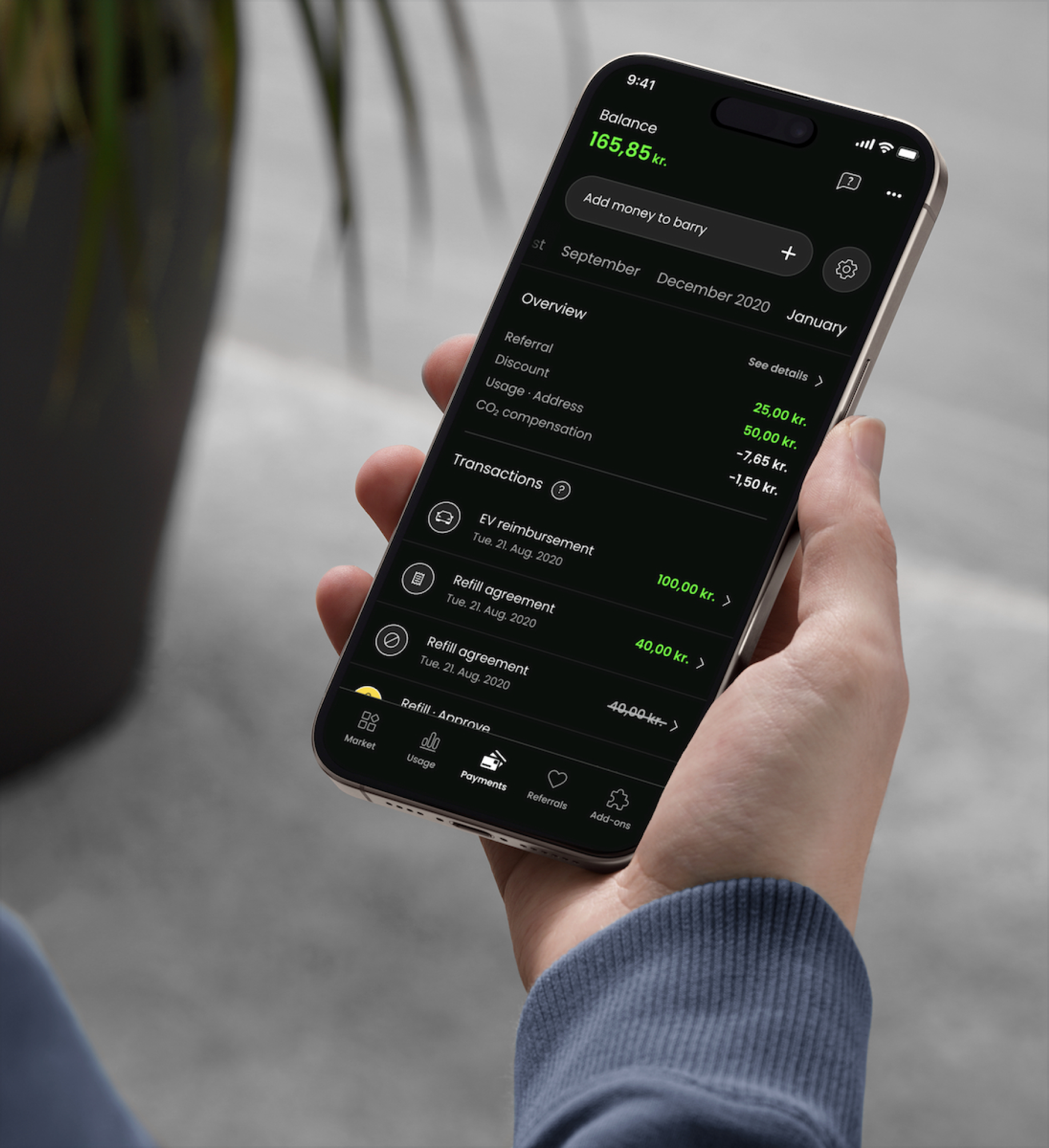
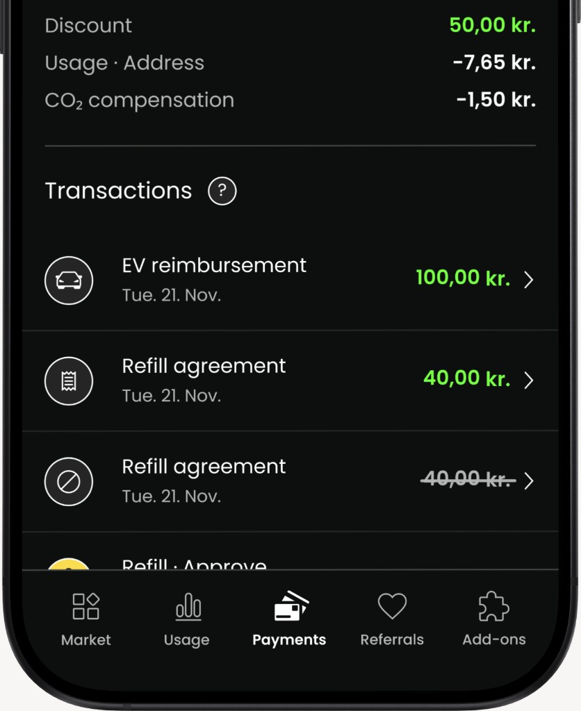
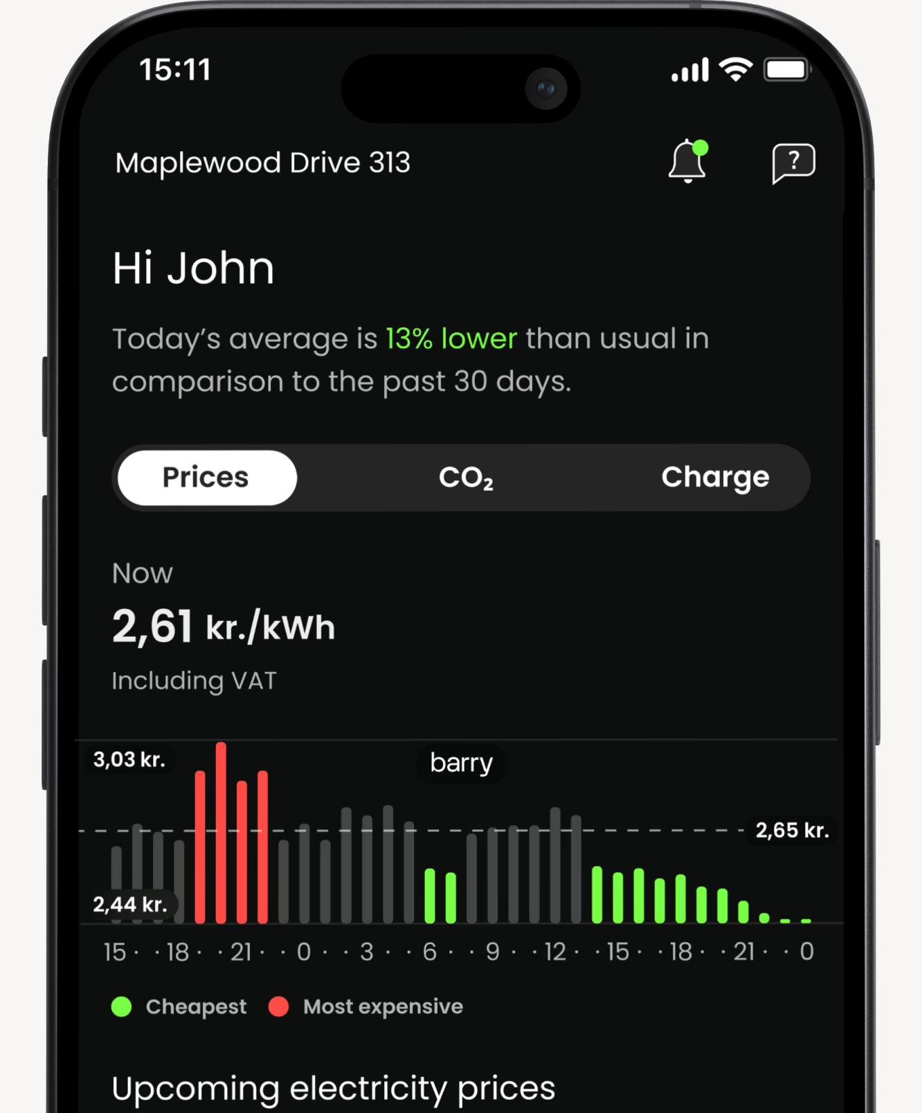
We introduced a functional color system across the interface to support faster interpretation of key data. We mapped every interaction to this system, price information used a green-to-red gradient, while EV charging was always shown in blue. Usage graphs inherited these meanings. Suddenly, users could scan the screen and understand the current state at a glance.
RESULT
User testing post-launch showed a clear shift. In comprehension tests, 82% of users could accurately explain what they were seeing and why it mattered, compared with 71% before. We also saw a 27% increase in users actively using price-based controls to adjust their consumption patterns, proving the design was not just clearer, but also actionable.